Introduction
Motivate You is an app that connects life and business coaches with their clients. It also helps clients stay engaged and provides tools like analytics for coaches to track progress and communicate effectively. The app needed a complete overhaul to improve usability, scalability, and customer retention.
As the Product Designer, my role was to redesign the app from the ground up while keeping some existing features. I led the entire design process—from user research to interaction design and usability testing. Working with a small budget and a team of volunteers, we aimed to create the best possible product.
Our main goal was to improve the user experience by solving pain points, streamlining workflows, and introducing a cohesive design system to support future growth.
Research
Problem statement
Coaches found it challenging to keep track of their clients’ progress effectively. They struggled with the lack of a streamlined way to record and monitor client development over time. Additionally, they dreamed of a platform that could take care of tedious administrative tasks essential to managing coaching sessions—such as scheduling, maintaining progress reports, handling notes, and organizing client information. Without these tools, coaches often faced inefficiencies that took time away from focusing on what mattered most: helping their clients succeed.
Target Audience:
Primary users are professional coaches who use the app to manage clients and sessions.
Secondary users are clients who engage with the app for updates, assignments and communication.
Methods:
- Interviews: Held one-on-one interviews with 5 coaches.
- Survey: Created Qualtrics User Survey
- Analytics review: Competitive analysis
Key findings
- Navigation Issues: users found the app to be incomplete
- Onboarding Gaps: Users felt overwhelmed by the setup process
- Limited features: Coaches wanted more of the app to take on certain tasks
- Inconsistent UI: The inconsistent components caused confusion.
- App didn’t connect coaches to clients all that well.
Ideation
Brainstorming
Methods:
Lightning Decision Jam (LDJ)
The Lightning Decision Jam (LDJ) is an exercise created by AJ&Smart as an easy way to help your team make faster decisions and find quick direction. This includes several exercises that help improve brainstorming.
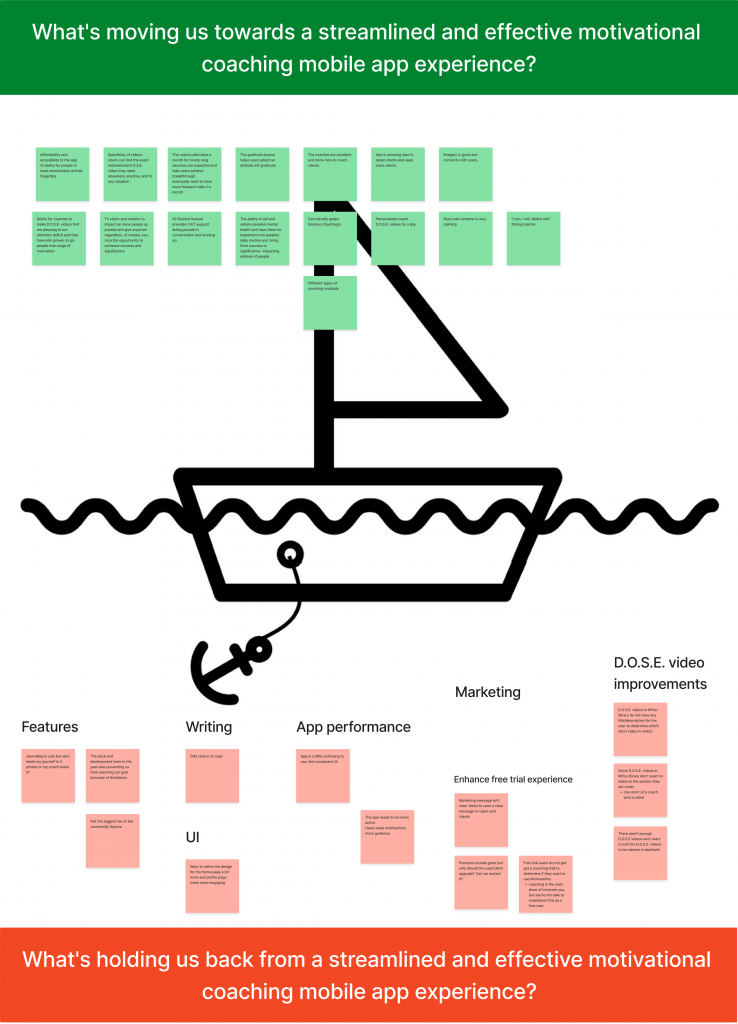
The sail boat exercise
The Sailboat Exercise helps teams define a vision of where they want to go. Then, the exercise will help them identify risks, what slows them down, and what contributes to them achieving their objectives.
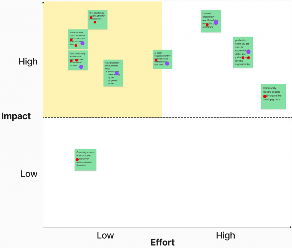
Impact – Effort Scale
An impact effort matrix (also known as an action priority matrix) is a decision-making tool you can use to prioritize tasks based on their potential impact and the amount of effort required to implement them.
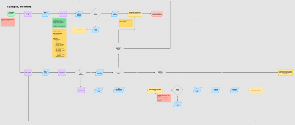
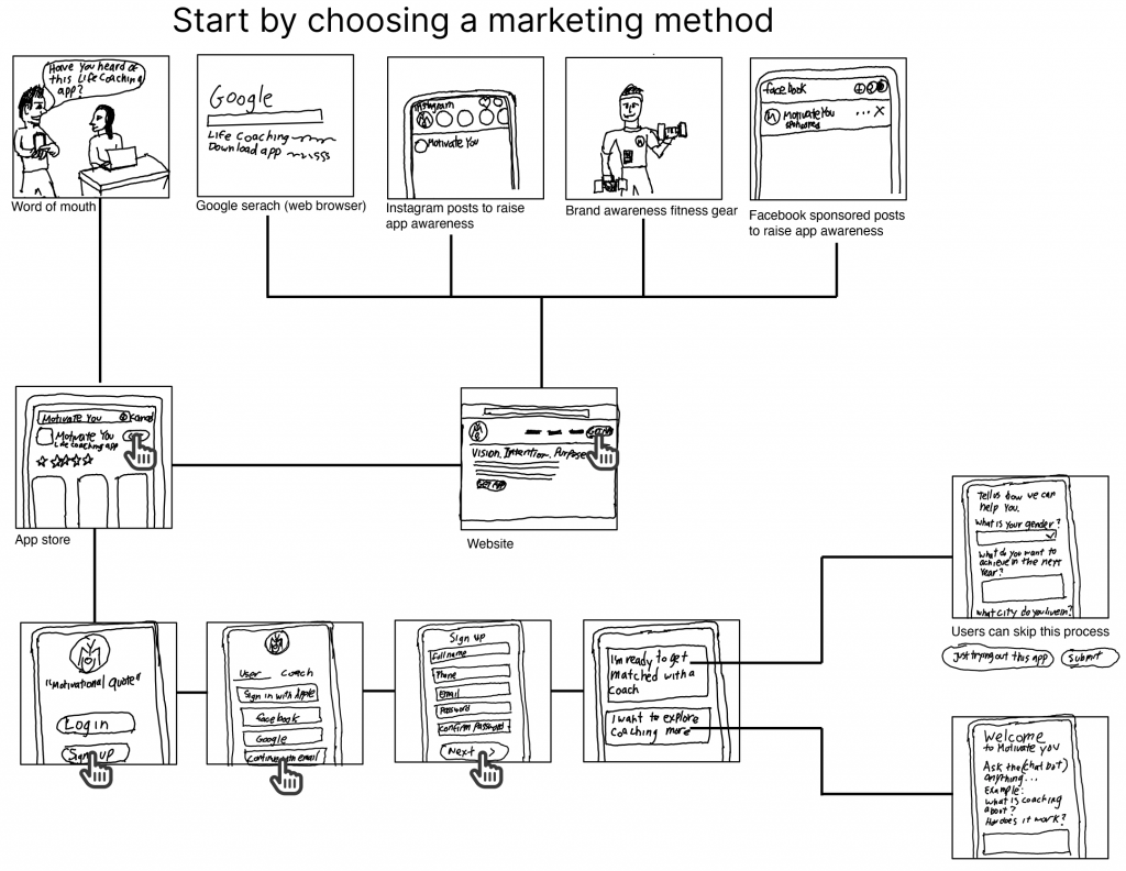
Story boarding (flow chart)
A storyboard is a visual representation of a story or narrative. It’s a creative process traditionally used to plot the key scenes in a movie or show. In this case, the story board is a flow chart to tell the story of the many scenarios facing Motivate You app.
Personas
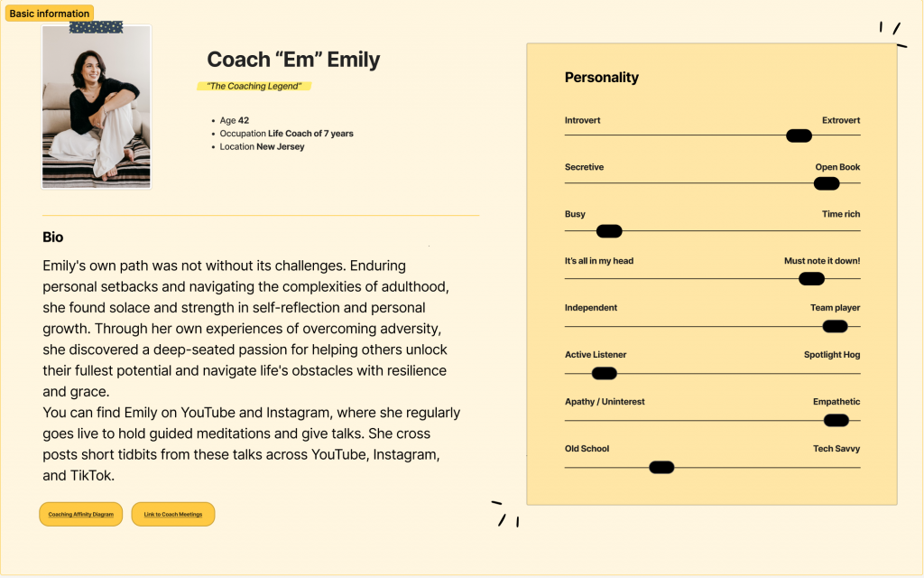
The team created a fictional persona based on interview findings.
Solutions:
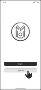
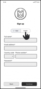
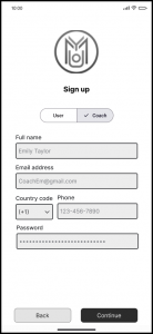
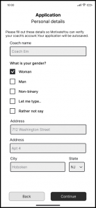
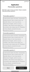
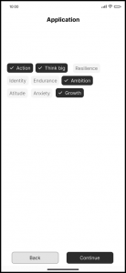
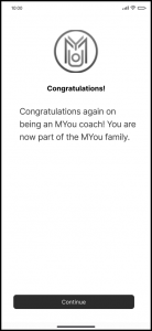
Improve sign up and registering screens
Coach’s sign up process
Created a unified UI kit for consistent UI components
Low Fidelity wireframes of the “sign up process”

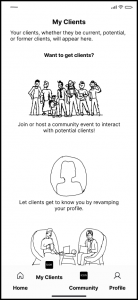
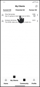
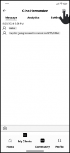
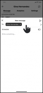
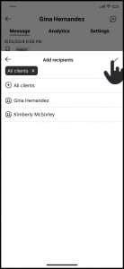
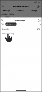
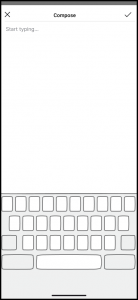
Coach’s My Clients Page
Low Fidelity wireframes of the “My Clients” screen
Feature Prioritization
Based on research and stakeholder input, we focused on:
- Simplifying navigation
- Improvements to onboarding
- Incorporate a UI kit to the design system
- Increase functionality of the app
Design Process
The design process started with Lightning Decision Jam exercises then went into Design Thinking methods. Lightning Decision Jam allowed us to take a step back with subject matter experts and see what was wrong with the current application. This was a quick set of exercises that gave a snapshot of the application, however we needed to use Design Thinking (Stanford Model) when working on the application.
User flows and Information Architecture (IA)
We used User flows and Information architecture as visual representations of the steps a user takes to complete a specific task or achieve a goal within a product, app, or website. They map out the sequence of screens, actions, and decisions a user interacts with to perform an action, such as signing up, or booking a coach’s service.
UX Design
Three fundamental aspects of UX design are hierarchy, structure, and navigation. These elements work together to guide users through your product seamlessly:
- Hierarchy ensures that the most important information or actions are prominently displayed.
- Structure organizes content logically, making it easy for users to understand.
- Navigation provides clear pathways for users to explore and accomplish their goals.
Starting with low-fidelity, black-and-white designs is essential. This approach simplifies the process, allowing you to focus on these core elements without being distracted by visuals like colors or typography. Breaking your app into stages at this phase ensures a strong foundation for user interactions.
Accessibility
Accessibility should be a primary focus throughout the design process. To create an inclusive experience:
- Avoid relying solely on color to convey meaning (e.g., error states or statuses).
- Use icons, text labels, or patterns in addition to color to ensure all users, including those with visual impairments or color blindness, can understand the interface.
By prioritizing these principles, your product will not only meet accessibility standards but also deliver a better experience for all users.
UI Design
The user interface design is currently a work in progress. A branding agency is tasked with defining the look and feel, ensuring it aligns seamlessly with the desired brand identity and style guidelines.
Stakeholders
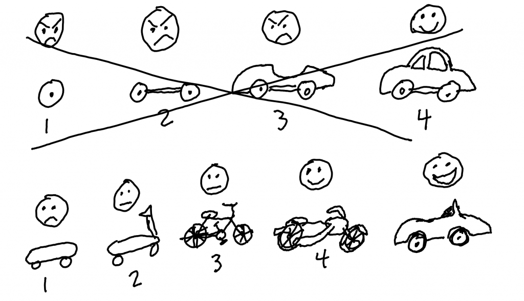
When collaborating with stakeholders, it was crucial to ensure they understood the UX goals and were educated on the design process. One of the most debated topics was determining the Minimum Viable Product (MVP). The image below provides a clear visualization for stakeholders, illustrating what the initial MVP should look like and how it will evolve over time.
In the “skateboard stage,” the focus was on addressing the most basic user needs. For Motivate You, this meant designing a seamless experience to connect clients with coaches effectively. Future iterations will build on this foundation, introducing additional features and functionality. Our primary goal was to deliver a design that solved the immediate problem while laying the groundwork for future growth.
Conclusion
While this project is still ongoing, it’s essential to reflect on and share the key steps I took to play a crucial role in bringing this application to life. Documenting your process is not just about capturing the journey, it’s a way to learn, grow, and refine your approach with every project. By identifying what worked well and what could have been improved, you build a framework for future success.
Even if this project does not achieve its intended goals, it won’t be a failure as long as the lessons learned are captured and applied to future endeavors. Every misstep or challenge provides valuable insights that can inform better decisions moving forward. Embracing this mindset ensures that no effort is wasted and that every project contributes to personal and professional growth.

