 Sergio
It’s been a long way since the first ever website in 1991. It started out exclusively text-based to full colors and animation as we see today. As screen resolution and colors improved so did web designs. Here is a history of user interfaces in websites.
Tim Berners-Lee the inventor of the web in 1990, also invented HTML which was based on SGML (Standard Generalized Markup Language). HTML became more appropriate for mass consumption in 1992. It was written by Dave Raggett who looked through magazines and newspapers to get an idea of how to create HTML features. It wasn’t until 1993 where the first browser called Mosaic was released for Sun Microsystems Inc.’s workstation. It added images, nested lists and fill-out forms.
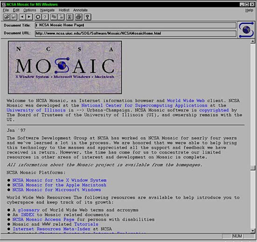
Mosaic Browser
April 22, 1993 Mosaic Browser
In early 1994, lots of browsers had added their own bits to HTML. HTML became ill-defined. After much standardization, HTML 2 had become widely used. In March 1995 HTML 3 is published. It dealt with tables, tabs, footnotes and forms. Tables provided a layout grid for organizing pictures and text on the screen. Support for Style sheets and class attribute was made available to give HTML element styles as much as you can do in desktop publishing.
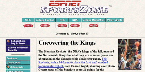
ESPN Website
You can see the tables being used on ESPN 1995 website.
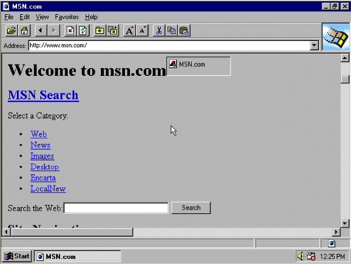
It wasn’t until November 1995 where style sheets began to take shape and Cascading Style Sheets was born. Most early websites were experimental such as CNN.com initially launched on August 30, 1995. Website were simple and text-based built in the first generation of HTML. Web and software developers paid a great deal of attention to making menus, buttons, and links look “clickable”. Website navigation was a new frontier and was challenging for many users.
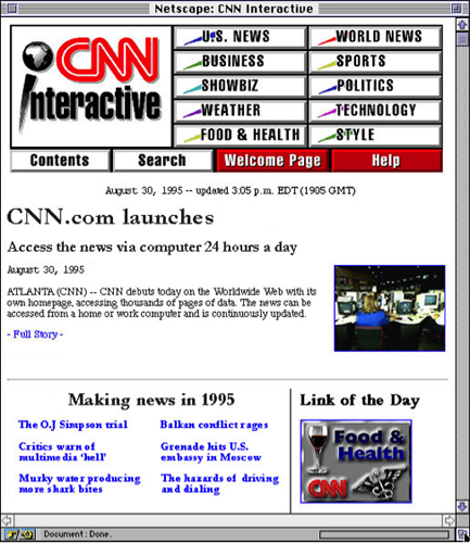
CNN Interactive
In April 1996 Microsoft’s Internet Explorer becomes available for Macintosh and Windows 3.1 systems. At this time, Microsoft and Netscape were inventing tags on their own this lead to different appearances on both browsers.
Internet Explorer
FutureSplash Animation (Flash 1.0) was released in May 1996. Flash 1.0 gets a lot of credit in making websites animate and had developers think about navigation. FutureSplash Animator is a vector graphics and vector animation program. It was the first of it’s kind to have basic editing tools and a timeline to animate on the web. Flash opened up a world of design possibilities that weren’t possible with basic HTML.
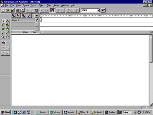
FutureSplash Animator
Disney’s Daily Blast, MSN and Fox Broadcasting Company used the program for many of their animations. This was the true beginning of interactive design. From 1996 to 1999 Flash added MovieClips, JavaScript (the precursor to Action Script) Alpha transparency, and other features.
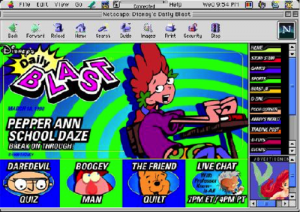
Disney’s Daily Blast
1998 Disney’s Daily Blast was nominated for a Webby Award.
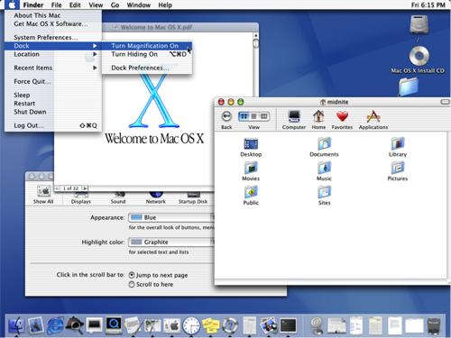
By 1999-2000 HTML websites started to look better with a focus on it’s design. Internet Explorer was released for the mac, it was the first browser to support HTML 4.01 and CSS1. This raised the bar in terms of standard compliance. It was the first browser to support PNG image format.
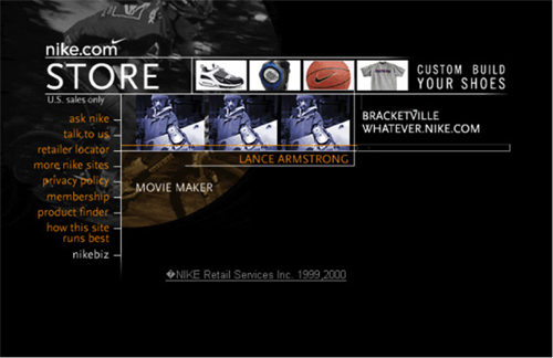
1999 Nike website
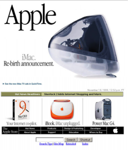
Apple Website
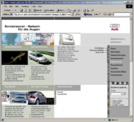
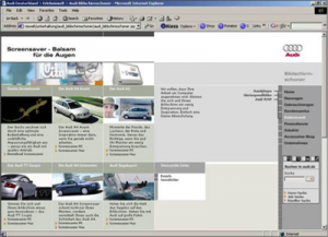
Fluid layouts started gain in popularity around 2000 as an alternative to HTML table-based layouts. The popularity came with varying screen sizes being sold and varying window sizes. However the first website to feature a layout that adapt to browser viewport width was Audi.com in 2002. The website done by Razorfish in Hamburg was the first responsive website with 3 possible widths.
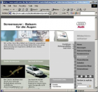
Audi.com first responsive website640×480 (small)
Audi.com first responsive website800×600 (medium)
Audi the first responsive website1024×768 (large)
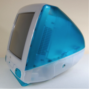
Web 2.0 style of design became popular in 2000. There were drop shadows, shiny bubbles, oversized buttons and glares. Designers used those tools to educate web users on how to navigate web content. These graphic tools trained us to “click here” and “learn more” all while serving up a feast for our eyes as color and gradients. It is possible that this trend was set first with Apple’s OSX GUI called Aqua.
Aqua’s inspiration came from its popular iMacs. Apple Glossy Web 2.0 design
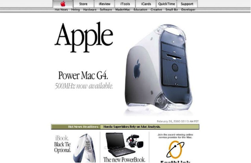
Apple 2000
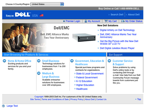
Dell 2003 glossy and gradients
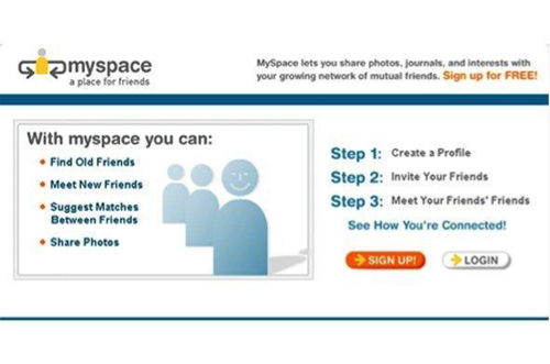
Myspace in 2003
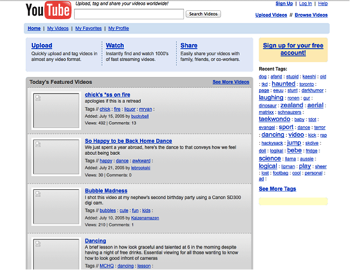
Youtube 2005
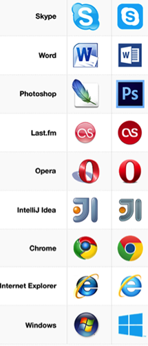
Skeuomorphic design (2010 – 2012) is the practice of incorporating the visual characteristics of an object into a digital design. It involves taking the functional aspects and qualities of an object and recreating them in an ornamental way, with the intention to evoke a feeling of familiarity with an app, widget, tool etc. This was made popular with tablet and mobile apps.
Skeuomorphic websites
Flat design (2012-present) is characterized by the elimination of graphical elements that have no significant value or purpose within a user interface. Simplicity is key: decorative elements such as gradients, textures and reliefs are avoided. The style utilizes open space, bright colors, sharp edges and two-dimensional illustrations with a strong focus on usability. Omitting complex graphics means that users have less distraction and can focus on content.
Flat design may also include icons or a pictogram to help the user navigate a website or a mobile site. An icon is a quickly comprehensible symbol that acts much more of a traffic sign than a detailed illustration. Icons have existed on the computer since 1981 Xerox 8010 Star. It was the first computer with a Graphical User Interface. Icons have proven to be the best method to describe complex ideas or programs. Icons were used on websites since images were able to be used in 1993 on the Mosaic browser. As monitor resolution and color improved so did the icons. Today icons are represented in a flat 2D graphic for its simplicity as opposed to the Skeuomorphic trend.
Skeumorphic icons
Flat design also thought as minimalism made us rethink how we layout pages. This put a focus on hierarchy, structure and navigation. See the example below:
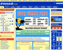
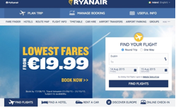
UI Ryanair
In 2007, Ryanair website was loud and cluttered, with a garish yellow background and overwhelming navigation. That has all changed. Now, in 2015, their design has become the epitome of minimalism, with clean lines, easy navigation, and a simpler color palette. The user experience is vastly improved, and has contributed to a recent 25% growth in quarterly profits.